QRU
Not decoration, but pinning down who you are.
The question
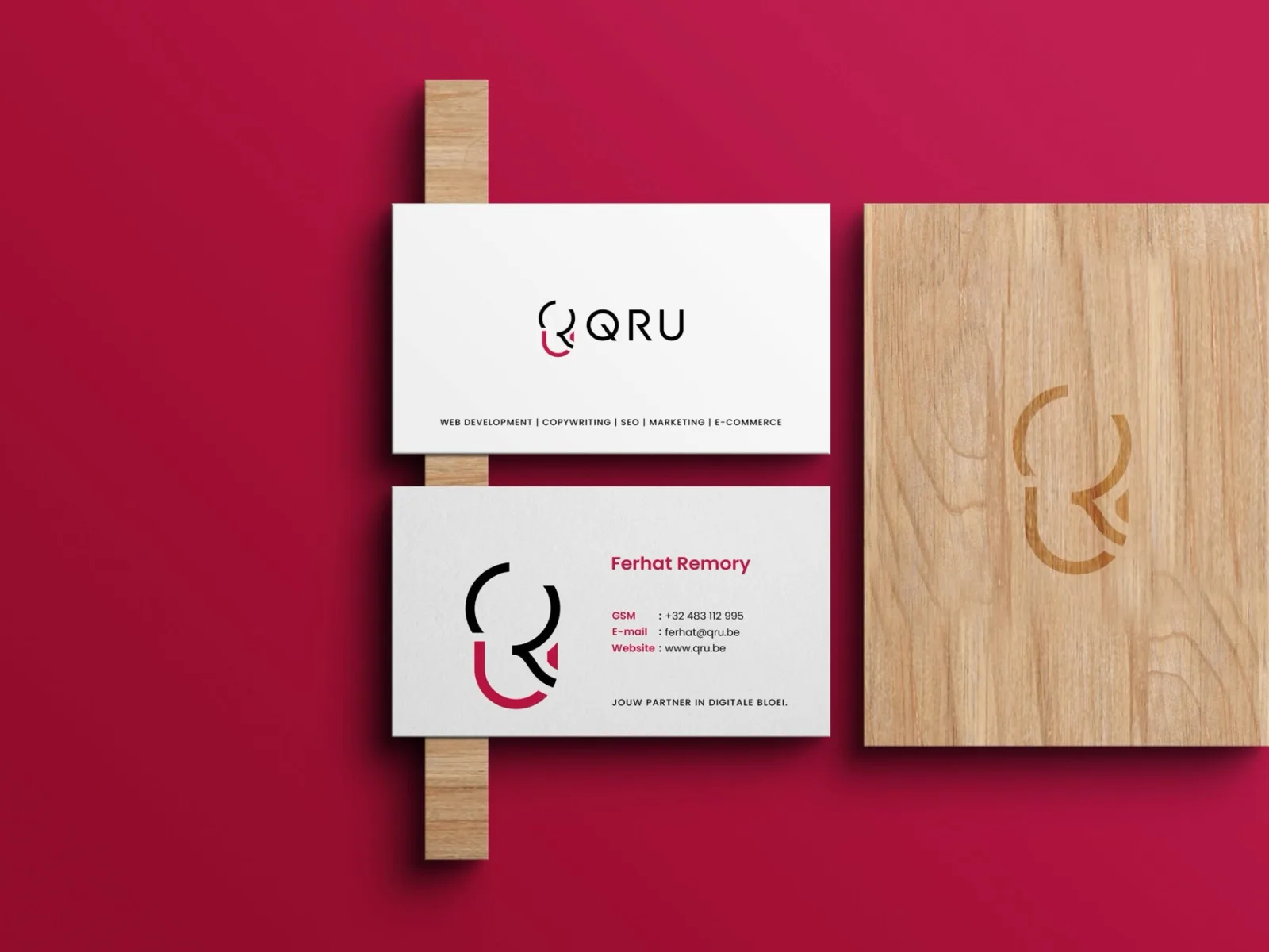
QRU needed a brand that conveys simplicity, vision and strength. It was not about making something pretty, but about pinning down who they are.
Every element had to be clear, the same everywhere, and true to what the company stands for.
What I did
A bold, minimal logo in which the three letters collapse into one shape. That mark stands for working together, unity and direction.
Then carried through to business cards and stationery, because a logo that only works on a screen is only half finished.
What it delivered
QRU now has an identity that holds up at any size, from a business card to a building. And that grows with the company.
Other projects


Stipt
A web app for shop inspections: walk your round on your phone, and anything out of order automatically becomes an action point with a name and a deadline. Built from scratch, from the first screen to the invoicing.
See this project →

TuinKlussen.be
A marketplace where garden owners post their job and gardeners from the same area respond. Built from scratch, from the first table to the mascots.
See this project →

Likeboost24.nl
An online store for followers, likes and views that passes orders straight to the supplier. No account, no password, pay with iDEAL.
See this project →